

Harvard Pilgrim Health Care: Enhanced Fitness Reimbursement Tool.
Role: UX Design, Information Architecture
Team: Daniel Dodman (Design Lead), Casey Addy (Design Strategy), Matthew Pugsley (UX Research)
Timeline: 01/2023 - 06/2023
Project Overview.
Harvard Pilgrim Health Care offers digital reimbursement benefits for fitness and wellness activities. The existing tool was outdated and overly complex, causing member confusion, incomplete submissions, and increased call center volume.
Our team’s goal was twofold:
Simplify and modernize the fitness reimbursement experience.
Introduce a new wellness reimbursement pathway to broaden access to health and wellness benefits.
I contributed to the end-to-end redesign, including research, journey mapping, information architecture, UI enhancements, and creation of entirely new screens for the wellness reimbursement flow.
The Challenge.
Users faced several challenges with the original tool:
Complex, unclear process: Multiple steps and confusing instructions caused errors and delays.
Limited benefit accessibility: Only traditional fitness activities were supported.
Inconsistent feedback messaging: Errors and warnings were vague, leaving users unsure how to correct issues.
Cognitive overload: Poor content structure and unclear visual hierarchy increased frustration.
Objective: Create a simpler, more intuitive tool that supports both fitness and wellness reimbursement, while maintaining accessibility and consistent UI patterns.
My Role.
Redesigned user journeys and screen flows for both fitness and wellness reimbursement.
Refined information architecture and content strategy for clarity and cognitive ease.
Rewrote UX copy for errors, warnings, and confirmations with plain, supportive language.
Utilized the brand new unified design system custom iconography to visually differentiate feedback states.
Applied accessible, modular UI components to ensure consistency and usability across both flows.
Process & Approach.
Research & Discovery
Conducted content audits to identify pain points.
Collaborated with stakeholders to clarify eligibility rules and requirements.
Mapped existing user journeys to identify friction points and bottlenecks.
Ideation & Flow Design
Developed streamlined, linear flows for fitness and wellness reimbursement.
Used progressive disclosure to reduce cognitive load.
Designed mirrored modular paths to maximize reuse of components while addressing unique wellness needs.
UX Writing & Visual Design
Rewrote feedback messages for clarity and reassurance.
Created custom icons to improve comprehension of warnings, errors, and confirmations.
Optimized visual hierarchy of forms, modals, tables, and data inputs to guide user attention.
Implementation & Iteration
Tested flows with internal stakeholders to refine usability.
Ensured all designs adhered to accessibility standards and responsive best practices.

Solution.
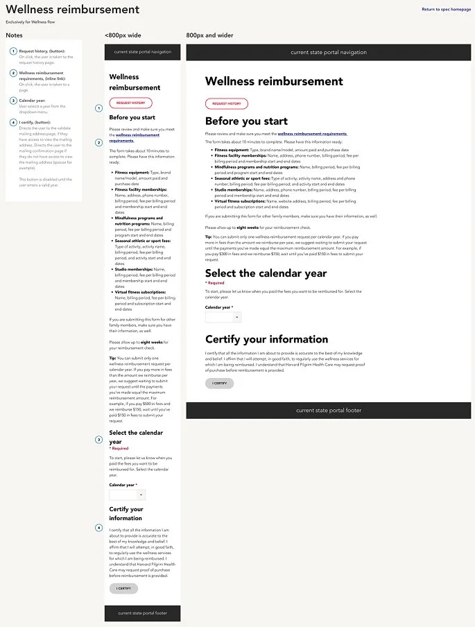
Introduced a new wellness reimbursement flow to expand benefit options.
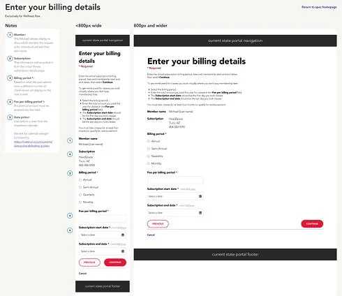
Simplified the fitness reimbursement journey, reducing steps and friction.
Enhanced information architecture and content structure across all screens.
Redesigned feedback messaging for clarity, empathy, and trust.
Delivered a modular, accessible, and cohesive UI supporting both flows.
Impact & Results.
Usability testing and stakeholder walkthroughs both showed measurably faster task completion across the end-to-end fitness reimbursement flow.
Introduced a brand-new wellness reimbursement pathway built on shared modular components, expanding benefit access to activities like mindfulness and online coaching without adding cognitive load for members.
Reduced submission errors and member confusion through redesigned feedback states and plain-language UX copy across both flows.
Delivered a modular, accessible, and visually consistent UI that serves both fitness and wellness reimbursement within a single cohesive experience.
Reflection.
This project reinforced the importance of designing for clarity in complex, policy-driven systems.
Collaborative research and stakeholder engagement were crucial to balancing user needs with regulatory requirements.
Thoughtful UX writing, iconography, and information hierarchy can significantly reduce user anxiety and improve completion rates.
Future iterations could further optimize content strategy and explore more personalized guidance for users with varying wellness goals.