

Point32Health: Directional Design & Navigation Optimization.
Role: Visual Design & Development, UX contributions
Team: Daniel Dodman (Design Lead), Casey Addy (Design Strategy), Matthew Pugsley (UX Research)
Timeline: 01/2023 - 06/2024
Project Overview.
After the merger of Harvard Pilgrim Health Care and Tufts Health Plan, the new parent company, Point32Health, needed a unified digital experience.
Users struggled to navigate multiple portals, manage benefits, and process claims efficiently.
My contribution focused on visual design, implementation, and supporting UX improvements to create an intuitive, accessible, and cohesive navigation system across the organization’s digital ecosystem.
The Challenge.
Point32Health faced several usability challenges:
Complex portals: Multiple entry points and inconsistent navigation frustrated users.
Low engagement: Users struggled to find critical information, decreasing satisfaction and task completion.
Accessibility gaps: Inconsistent design patterns limited inclusivity.
Regulatory constraints: Health care compliance created design limitations.
Objective: Simplify navigation, improve content discoverability, and align the member portal with the public website.

My Role & Contributions.
Designed and implemented visual solutions supporting UX research insights
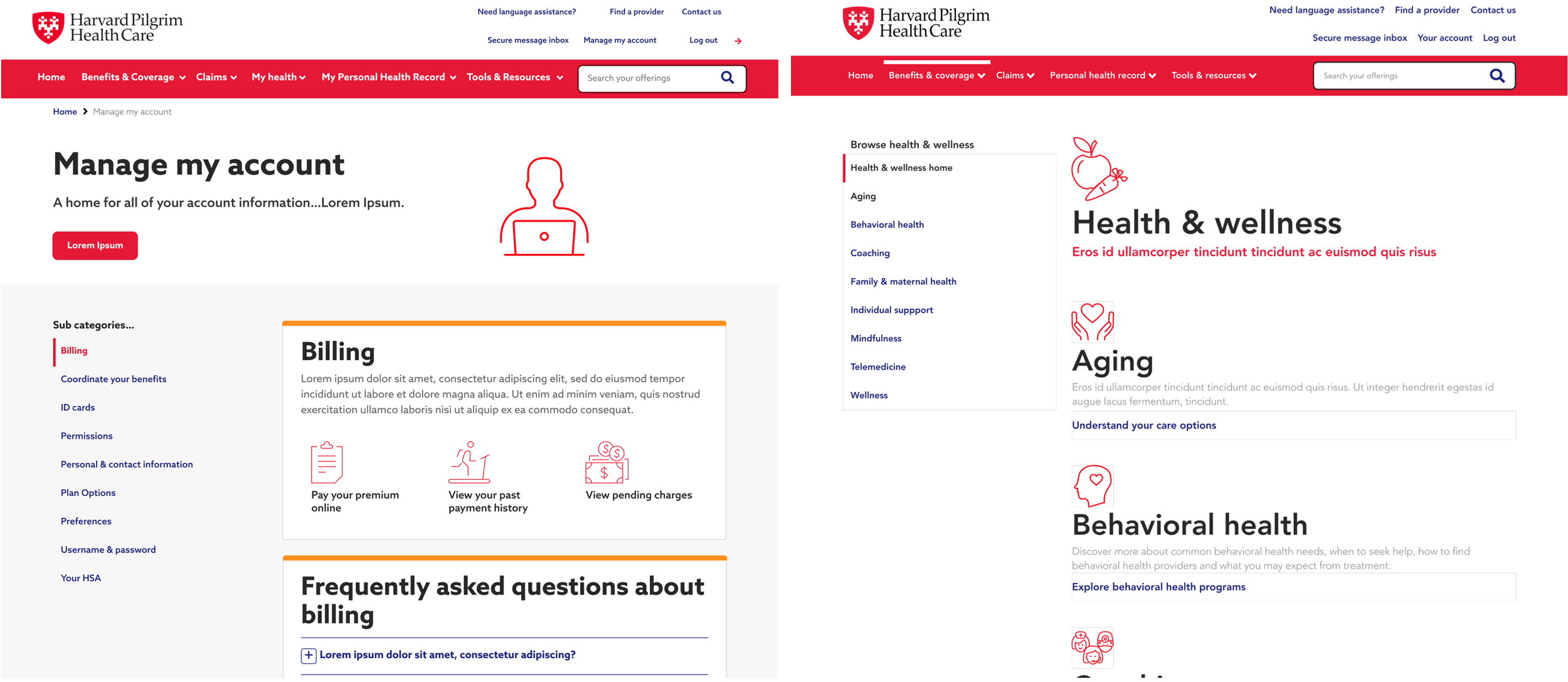
Simultaneously aided in this ongoing project and designed, developed, implemented the unified design system
Applied unified design system components to maintain consistency
Collaborated with cross-functional teams to resolve terminology inconsistencies and accessibility challenges
Advocated for directional design patterns that improved wayfinding and task completion
Process & Approach.
Discovery
Analyzed site analytics to identify high-friction areas
Conducted competitive benchmarking to align with industry standards
Collaborated with UX research on card sorting and tree testing
Ideation
Mapped navigation flows based on user behavior and research
Proposed design patterns to improve clarity, scanability, and accessibility
Implementation
Applied the unified design system for visual and functional consistency
Iterated on design solutions with stakeholder feedback and usability testing
Navigated organizational and regulatory constraints by prioritizing accessibility improvements and mobile usability: areas where we could drive clear, measurable impact within existing limitations.
Solution.
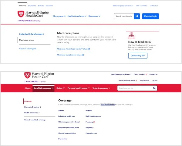
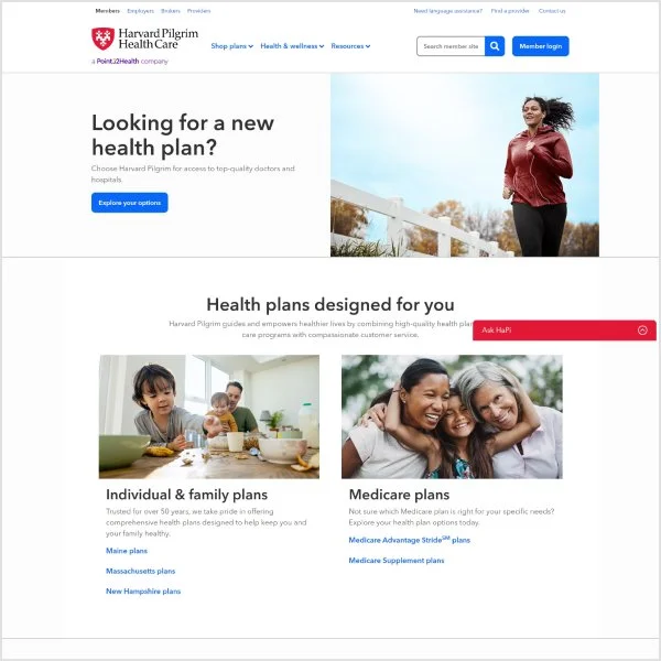
Streamlined navigation across member portals and public websites
Enhanced search functionality and information architecture for easier discovery
Improved accessibility compliance across all key user journeys
Designed with directional cues to guide users efficiently through complex processes
Impact & Results.
60% improvement in member portal navigation usability
Increased task completion rates and user satisfaction
Cohesive visual and functional design across platforms
Lessons learned prioritized for future improvements, including hub navigation refinement and content optimization
Designed with accessibility compliance at the forefront to ensure inclusive access for all users
Leveraged components from the organizations’ unified design system for visual and functional consistency
Enhanced utility and clarity of navigation paths to better serve diverse user needs.
Reflection.
This project reinforced the importance of designing for clarity in complex systems. Collaboration with UX research and design strategy was key to creating a usable, accessible experience under regulatory and organizational constraints. Moving forward, I would continue to iterate on navigation refinements and expand content optimization to further enhance user outcomes.